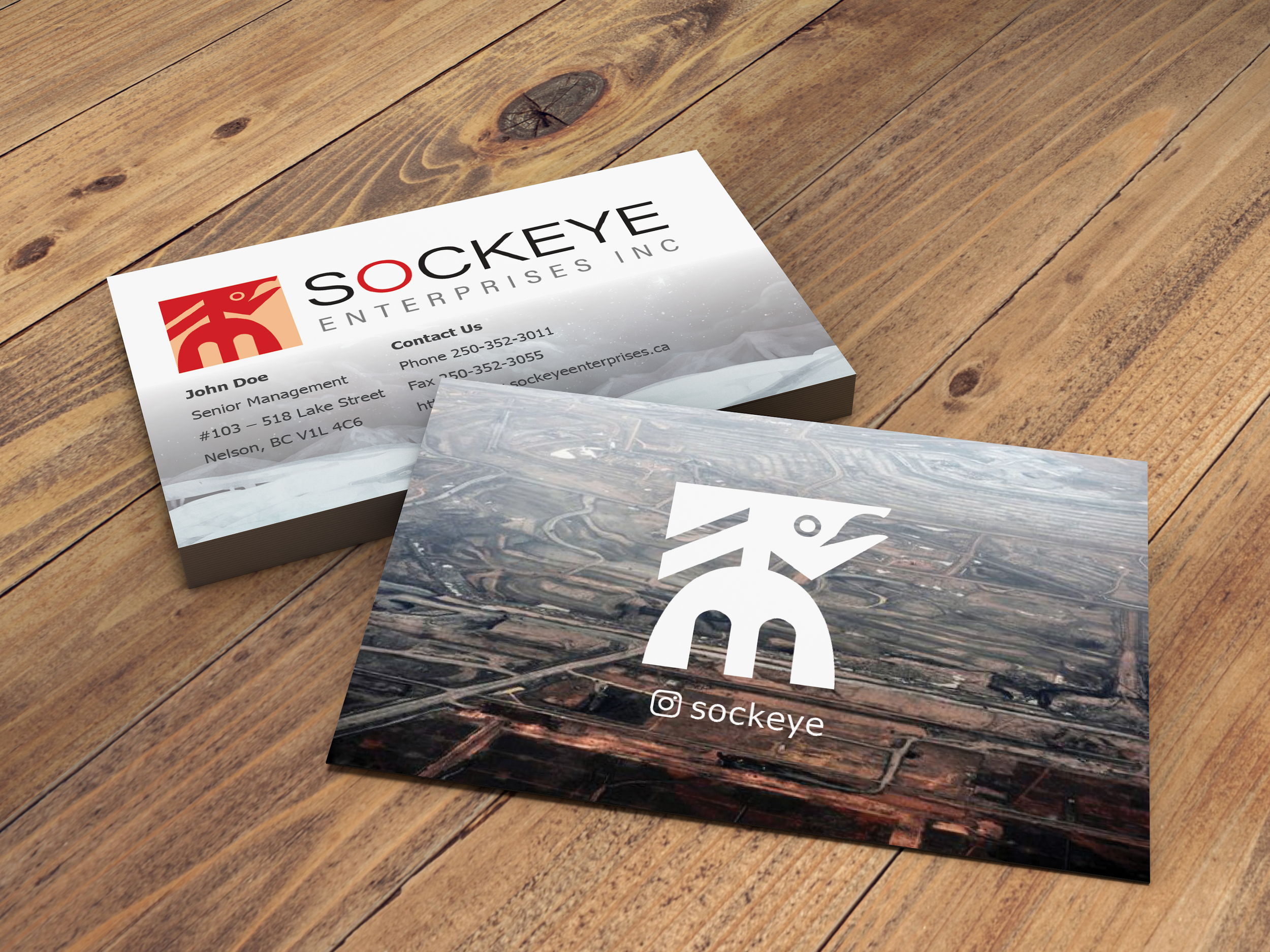
Sockeye
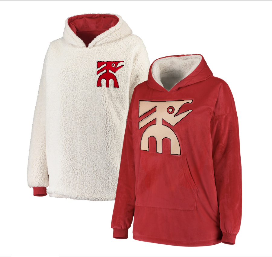
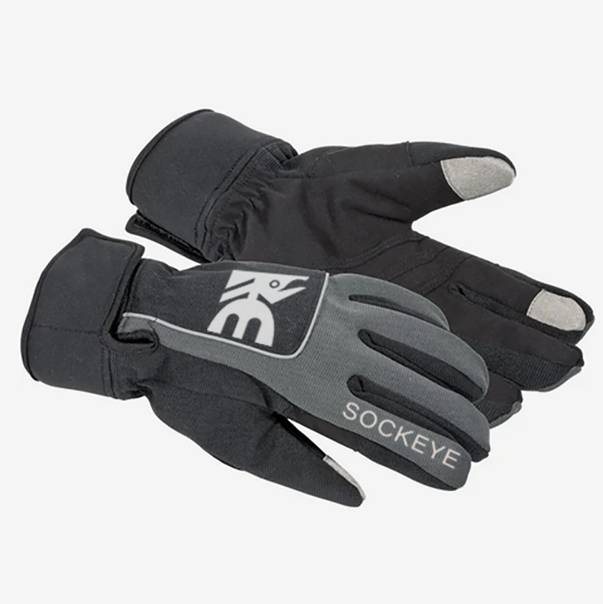
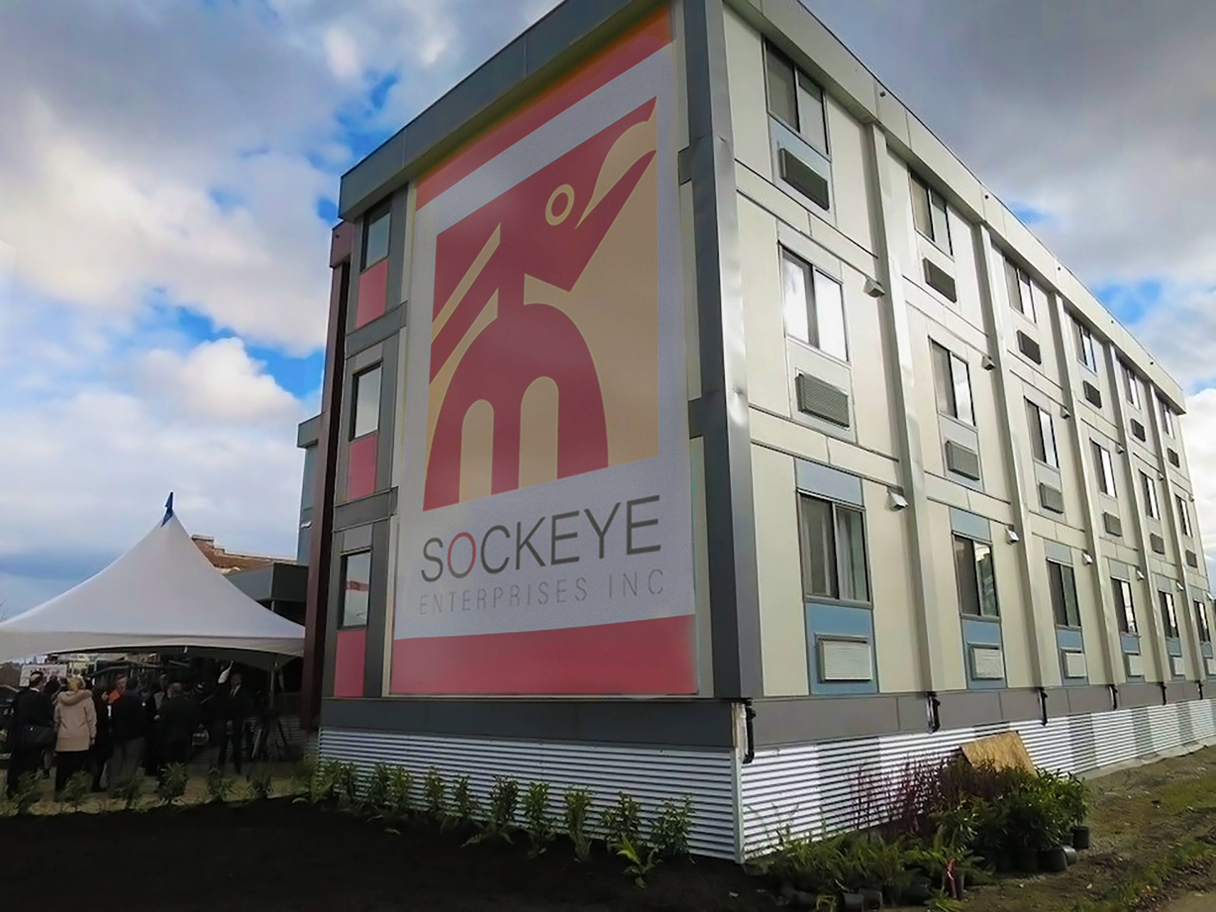
A logo design exercise for a fictional brand identity overhaul. Sockeye Enterprises was conceived as a construction company specializing in modular installation, serving the needs for Canadian businesses and disaster relief in remote locations.
What I found to be the most memorable design is one makes use of prominent characteristics of the sockeye salmon, as well as strong diagonals and arches to create a secondary meaning of a house or shelter.
The colour version of the logo fits into the shape of a square to emphasize stability. The primary colour red is for the bold and innovative spirit of the business, while the secondary orange is derived from the construction and safety-based roots of the company. Peer feedback found the brand identity to be successful in creating a strong impression, embodying the traits of hardy, rustic, down-to-earth and survivalist.